
The Copernicus image from September 2025 shows sea ice below historical average at both Poles. A clear signal: the climate crisis spares neither the North Pole nor the South Pole
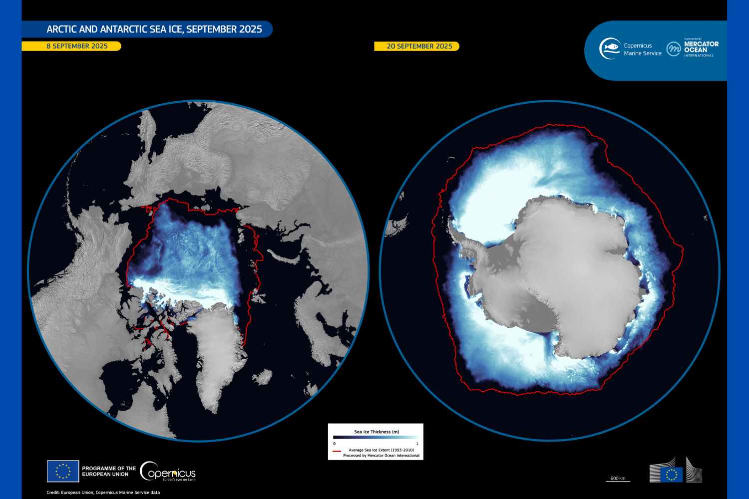
The image of the day, provided by the Copernicus Marine Service, is not just a map: it’s a visual testimony of the climate crisis at its extremes. The left panel, captured on September 8, 2025, and the right one, dated September 20, show the Poles at the most critical moment of their annual cycle, transforming data and numbers into an immediate and understandable narrative. The power of photography lies in its clarity: comparing the two hemispheres, the anomaly is immediately perceptible, making it evident that the reduction of sea ice is no longer a distant phenomenon, but concrete and measurable.

@European Union, Copernicus Sentinel-2 imagery
Every September marks the end of polar summer in the Arctic, when sea ice reaches its annual minimum extent. At the same time, Antarctica emerges from the austral winter, reaching its maximum sea ice extent. These cycles are fundamental to Earth’s climate system, showing how each hemisphere responds to seasonal warming and cooling.
This year, however, Copernicus images document worrying anomalies. Data analysis conducted by Mercator Ocean International highlights a double negative record:
- Arctic at 7th historic minimum: Arctic sea ice stopped at 1.61 million square miles (4.18 million km²), the seventh lowest value ever recorded.
- Antarctica at 3rd lowest maximum: Antarctic sea ice reached 6.68 million square miles (17.31 million km²), resulting in the third lowest maximum since 1993.
Copernicus images make it immediately evident that both the Arctic minimum and the Antarctic maximum are below the 1993-2010 average. The simultaneous photograph of the Poles demonstrates that ice loss is not an isolated phenomenon, but global and constant. Observing the difference between current extents and historical averages, one understands the speed at which the planet’s natural balances are changing, a visual warning that surpasses words.
The Copernicus Marine Service provides high-resolution data on sea ice extent and thickness, transforming them into visual tools that help understand the scale of the crisis. The double photo from September 2025 is not just informative: it becomes an immediate comprehension tool, clearly showing how both Poles are traversing territories never seen before, with possible cascading effects on global climate, ocean currents, and marine ecosystems.
Source: Copernicus